> ## Documentation Index
> Fetch the complete documentation index at: https://translations.mintlify.site/llms.txt
> Use this file to discover all available pages before exploring further.
> Learn about Form nodes and available components.
# Nodes and components
Forms lets you add nodes and components, such as fields, blocks, and widgets for your users to interact with the form. You can then reference the data input, from components, in your forms and flows.
## Form nodes
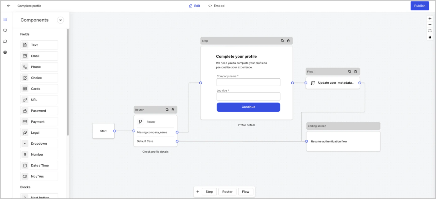
There are five types of form nodes: Start, Step, Flow, Router and Ending screen. These nodes have a very specific purpose for the structure of the form.
 ## Step node
Step nodes are the visual representation of the form. They can contain any number of components, such as fields, blocks, and widgets where the user can fill in their data.
## Step node
Step nodes are the visual representation of the form. They can contain any number of components, such as fields, blocks, and widgets where the user can fill in their data.
 ### Field components
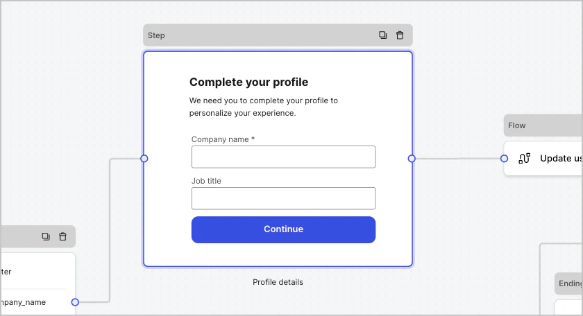
Fields are UI components where users input their information in Forms.
### Field components
Fields are UI components where users input their information in Forms.
 #### Field settings
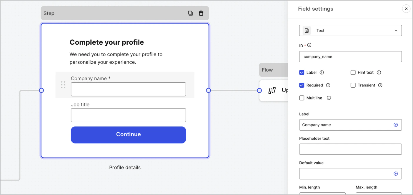
Fields have a number of default settings that you can configure to meet your requirements.
The default field settings are:
| Settings | Description |
| ---------------- | --------------------------------- |
| ID | The unique id |
| Label | Display or hide a label |
| Required | Input value is required |
| Hint text | Display a hint text |
| Placeholder text | Text visible to the user |
| Default value | Default value visible to the user |
| Transient | Enable or disable data mask |
#### Field validation rules
| Settings | Description |
| ------------------------- | ------------------------------ |
| Min. length / Max. length | Require an input value length. |
| Min. value / Max. value | Require a number value length. |
#### Available fields in Forms
The available fields with their specific settings and data output types are:
Standard input lets a user enter any string value.
##### Text field settings
The text field setting is:
| Settings | Description |
| --------- | ----------------------------- |
| Multiline | Enable multi-line input text. |
##### Text field output value
The text field output value data type is a `string`.
```json lines theme={null}
{
"text_field_id": "Auth0"
}
```
Standard input lets a user enter email string values.
##### Email field output value
The email field output value data type is a `string`.
```json lines theme={null}
{
"email_field_id": "username@domain.com"
}
```
Standard input lets a user enter phone number values.
##### Phone field settings
The phone field settings are:
| Settings | Description |
| ----------------------- | --------------------------------------------------------------------------------- |
| Country picker | Enable or disable Country picker. By default, it displays the user’s IP location. |
| Filter placeholder text | Text visible to the user in the country search window. |
##### Phone field output value
The phone field output value data type is either a `string` or, if Country picker is enabled, an `object` .
The phone field output data type value as a `string`:
```json lines theme={null}
{
"phone_field_id": "8005550175"
}
```
The phone field output data type value as an `object` :
```json lines theme={null}
{
"phone_field_id": {
"national_number": "8005550175",
"national_format": "(800) 555-0175",
"international_number": "+18005550175",
"international_format": "+1 800-555-0175",
"country_code_iso": "US",
"country_code_number": "1"
}
}
```
Standard input that lets a user select single or multiple choice values.
##### Choice field settings
The Choice field settings are:
| Settings | Description |
| -------------------------- | -------------------------------------------------- |
| Multiple choice | Enable several choice options. |
| Other option | Let users enter their own option. |
| Advanced > Internal values | Assign an internal value to each choice option. |
| Advanced > Bulk edit | Bulk edit label and internal choice option values. |
##### Choice field output value
The choice field output value data type is either a `string` or, if multiple choice is enabled, as an `array of strings` .
The choice field output data type value as a `string`:
```json lines theme={null}
{
"choice_field_id": "Option A"
}
```
The choice field output data type value as an `array of strings`:
```json lines theme={null}
{
"choice_field_id": ["Option A", "Option B"]
}
```
Standard input that lets a user select single or multiple choice image values.
##### Cards field settings
The cards field settings are:
| Settings | Description |
| -------------------------- | ----------------------------------------- |
| Multiple choice | Enable several choice options. |
| Hide labels | Hide card labels. |
| Advanced > Internal values | Assign an internal value for each option. |
##### Cards field output value
The cards field output value data type is either a `string` or, if multiple choice is enabled, as an `array of strings`.
The cards field output data type value as a `string`:
```json lines theme={null}
{
"card_field_id": "Option A"
}
```
The cards field output data type value as an `array of strings`:
```json lines theme={null}
{
"card_field_id": ["Option A", "Option B"]
}
```
Standard input lets a user enter a URL value.
##### URL field output value
The URL field output value data type is a string:
```json lines theme={null}
{
"url_field_id": "https://auth0.com"
}
```
Standard input that lets a user enter a password or a secret value.
##### Password field settings
The password field settings are:
| Settings | Description |
| ------------------------ | ------------------------------------------------------------------------------------------------------------------------------------------------------------------------------- |
| Require complex password | Passwords must contain an uppercase, a lowercase, a symbol and a number. |
| Enforce NIST guidelines | The password cannot be less than 8 characters, passwords obtained from previous breach corpuses, dictionary words, repetitive or sequential characters, content-specific words. |
| Add strength meter | A graphical meter with a red, yellow and green scale is displayed under the password field to show the strength of the password input. |
| Hash | Select an algorithm to hash the input value directly in the browser. |
##### Password field output value
The password field output value data type is a masked `string`:
```json lines theme={null}
{
"password_field_id": "███"
}
```
Standard input that lets a user enter payment information using a payment provider. Payments are processed before the Ending node.
##### Payment field settings
The payment field settings are:
| Settings | Description |
| ------------------- | --------------------------------------------------------------------------------------- |
| Payment type | Select either a one-off (Charge) or recurring (Subscription) payments. |
| Amount | Specify the amount for a one-off (Charge) payment. |
| Currency | Specify the currency for a one- off ( Charge) payment. |
| Subscription action | Select either to create or update an existing subscription. |
| Customer action | Select either to create or update an existing customer. |
| Display options | Display and edit Card number, Expiration date, and Security code labels and Trustmarks. |
##### Payment field output value
The payment field output value data type is either a string or an object for after submission flows.
The payment field output value data type as a `string`:
```json lines theme={null}
{
"payment_field_id": "pm_1P19e..."
}
```
The payment field output value data type for subscriptions as an `object` :
```json lines theme={null}
{
"payment_field_id": {
"payment_method_id": "pm_1P19e...",
"customer_id": "cus_PqrM...",
"price_ids": [
"price_1ONHR..."
],
"subscription_id": "sub_1P1A...",
"payment_intent_id": "pi_3P19e5..."
}
}
```
The payment field output value data type for charge as an `object` :
```json lines theme={null}
{
"payment_field_id": {
"payment_method_id": "pm_1P19e...",
"customer_id": "cus_PqrM...",
"amount": 100,
"payment_intent_id": "pi_3P19e5..."
}
}
```
Standard input that adds legal text and a check input.
##### Legal field output value
The legal field output value data type is a `boolean`.
```json lines theme={null}
{
"legal_field_id": true
}
```
Standard input that lets a user select single or multiple dropdown choice values.
##### Dropdown field settings
The dropdown field settings are:
| Settings | Description |
| -------------------------- | ----------------------------------------- |
| Multiple selector | Enable several choice options. |
| Advanced > Internal values | Assign an internal value for each option. |
| Advanced > Bulk edit | Bulk edit label and internal values. |
##### Dropdown field output value
The dropdown field output value data type is either a `string` or, if multiple choice is enabled, as an `array of strings` .
The dropdown field output data type value as a `string`:
```json lines theme={null}
{
"dropdown_field_id": "Option A"
}
```
The dropdown field output data type value as an `array of strings`:
```json lines theme={null}
{
"dropdown_field_id": ["Option A", "Option B"]
}
```
Standard input that lets a user enter number values.
##### Number field output value
The number field output value data type is a `number`.
```json lines theme={null}
{
"number_field_id": 123
}
```
Standard input that lets a user enter either a date or time values.
##### Date / Time field settings
The date/time field settings include:
| Key | Description |
| ------ | ---------------------------------- |
| Format | Select either Date or Time format. |
##### Date / Time field output value
The date/time field output data type value for date is a `string`:
```json lines theme={null}
{
"date_time_field_id": "2023-04-11"
}
```
The date/time field output data type value for time is a `string`:
```json lines theme={null}
{
"date_time_field_id": "23:15"
}
```
Standard input that lets a user enter true or false values.
##### Boolean field output value
The boolean field output value data type is a boolean.
```json lines theme={null}
{
"boolean_field_id": true
}
```
Standard field that you can customize to create your own field.
##### Custom field settings
The custom field setting are:
| Settings | Description |
| ----------- | ----------------------------------------------------------------------------------------------------------- |
| Params | Add key-value pairs to reference in the custom field source code. |
| Source code | Add your Javascript code to the custom field. |
| JSON Schema | By default, the custom field accepts any value format. However, you can use JSON Schema to validate values. |
To learn more, read [Custom Field Components for Forms](/docs/customize/forms/custom-field-components).
### Blocks components
Blocks are UI components that add functionality to your forms but do not gather user information.
#### Field settings
Fields have a number of default settings that you can configure to meet your requirements.
The default field settings are:
| Settings | Description |
| ---------------- | --------------------------------- |
| ID | The unique id |
| Label | Display or hide a label |
| Required | Input value is required |
| Hint text | Display a hint text |
| Placeholder text | Text visible to the user |
| Default value | Default value visible to the user |
| Transient | Enable or disable data mask |
#### Field validation rules
| Settings | Description |
| ------------------------- | ------------------------------ |
| Min. length / Max. length | Require an input value length. |
| Min. value / Max. value | Require a number value length. |
#### Available fields in Forms
The available fields with their specific settings and data output types are:
Standard input lets a user enter any string value.
##### Text field settings
The text field setting is:
| Settings | Description |
| --------- | ----------------------------- |
| Multiline | Enable multi-line input text. |
##### Text field output value
The text field output value data type is a `string`.
```json lines theme={null}
{
"text_field_id": "Auth0"
}
```
Standard input lets a user enter email string values.
##### Email field output value
The email field output value data type is a `string`.
```json lines theme={null}
{
"email_field_id": "username@domain.com"
}
```
Standard input lets a user enter phone number values.
##### Phone field settings
The phone field settings are:
| Settings | Description |
| ----------------------- | --------------------------------------------------------------------------------- |
| Country picker | Enable or disable Country picker. By default, it displays the user’s IP location. |
| Filter placeholder text | Text visible to the user in the country search window. |
##### Phone field output value
The phone field output value data type is either a `string` or, if Country picker is enabled, an `object` .
The phone field output data type value as a `string`:
```json lines theme={null}
{
"phone_field_id": "8005550175"
}
```
The phone field output data type value as an `object` :
```json lines theme={null}
{
"phone_field_id": {
"national_number": "8005550175",
"national_format": "(800) 555-0175",
"international_number": "+18005550175",
"international_format": "+1 800-555-0175",
"country_code_iso": "US",
"country_code_number": "1"
}
}
```
Standard input that lets a user select single or multiple choice values.
##### Choice field settings
The Choice field settings are:
| Settings | Description |
| -------------------------- | -------------------------------------------------- |
| Multiple choice | Enable several choice options. |
| Other option | Let users enter their own option. |
| Advanced > Internal values | Assign an internal value to each choice option. |
| Advanced > Bulk edit | Bulk edit label and internal choice option values. |
##### Choice field output value
The choice field output value data type is either a `string` or, if multiple choice is enabled, as an `array of strings` .
The choice field output data type value as a `string`:
```json lines theme={null}
{
"choice_field_id": "Option A"
}
```
The choice field output data type value as an `array of strings`:
```json lines theme={null}
{
"choice_field_id": ["Option A", "Option B"]
}
```
Standard input that lets a user select single or multiple choice image values.
##### Cards field settings
The cards field settings are:
| Settings | Description |
| -------------------------- | ----------------------------------------- |
| Multiple choice | Enable several choice options. |
| Hide labels | Hide card labels. |
| Advanced > Internal values | Assign an internal value for each option. |
##### Cards field output value
The cards field output value data type is either a `string` or, if multiple choice is enabled, as an `array of strings`.
The cards field output data type value as a `string`:
```json lines theme={null}
{
"card_field_id": "Option A"
}
```
The cards field output data type value as an `array of strings`:
```json lines theme={null}
{
"card_field_id": ["Option A", "Option B"]
}
```
Standard input lets a user enter a URL value.
##### URL field output value
The URL field output value data type is a string:
```json lines theme={null}
{
"url_field_id": "https://auth0.com"
}
```
Standard input that lets a user enter a password or a secret value.
##### Password field settings
The password field settings are:
| Settings | Description |
| ------------------------ | ------------------------------------------------------------------------------------------------------------------------------------------------------------------------------- |
| Require complex password | Passwords must contain an uppercase, a lowercase, a symbol and a number. |
| Enforce NIST guidelines | The password cannot be less than 8 characters, passwords obtained from previous breach corpuses, dictionary words, repetitive or sequential characters, content-specific words. |
| Add strength meter | A graphical meter with a red, yellow and green scale is displayed under the password field to show the strength of the password input. |
| Hash | Select an algorithm to hash the input value directly in the browser. |
##### Password field output value
The password field output value data type is a masked `string`:
```json lines theme={null}
{
"password_field_id": "███"
}
```
Standard input that lets a user enter payment information using a payment provider. Payments are processed before the Ending node.
##### Payment field settings
The payment field settings are:
| Settings | Description |
| ------------------- | --------------------------------------------------------------------------------------- |
| Payment type | Select either a one-off (Charge) or recurring (Subscription) payments. |
| Amount | Specify the amount for a one-off (Charge) payment. |
| Currency | Specify the currency for a one- off ( Charge) payment. |
| Subscription action | Select either to create or update an existing subscription. |
| Customer action | Select either to create or update an existing customer. |
| Display options | Display and edit Card number, Expiration date, and Security code labels and Trustmarks. |
##### Payment field output value
The payment field output value data type is either a string or an object for after submission flows.
The payment field output value data type as a `string`:
```json lines theme={null}
{
"payment_field_id": "pm_1P19e..."
}
```
The payment field output value data type for subscriptions as an `object` :
```json lines theme={null}
{
"payment_field_id": {
"payment_method_id": "pm_1P19e...",
"customer_id": "cus_PqrM...",
"price_ids": [
"price_1ONHR..."
],
"subscription_id": "sub_1P1A...",
"payment_intent_id": "pi_3P19e5..."
}
}
```
The payment field output value data type for charge as an `object` :
```json lines theme={null}
{
"payment_field_id": {
"payment_method_id": "pm_1P19e...",
"customer_id": "cus_PqrM...",
"amount": 100,
"payment_intent_id": "pi_3P19e5..."
}
}
```
Standard input that adds legal text and a check input.
##### Legal field output value
The legal field output value data type is a `boolean`.
```json lines theme={null}
{
"legal_field_id": true
}
```
Standard input that lets a user select single or multiple dropdown choice values.
##### Dropdown field settings
The dropdown field settings are:
| Settings | Description |
| -------------------------- | ----------------------------------------- |
| Multiple selector | Enable several choice options. |
| Advanced > Internal values | Assign an internal value for each option. |
| Advanced > Bulk edit | Bulk edit label and internal values. |
##### Dropdown field output value
The dropdown field output value data type is either a `string` or, if multiple choice is enabled, as an `array of strings` .
The dropdown field output data type value as a `string`:
```json lines theme={null}
{
"dropdown_field_id": "Option A"
}
```
The dropdown field output data type value as an `array of strings`:
```json lines theme={null}
{
"dropdown_field_id": ["Option A", "Option B"]
}
```
Standard input that lets a user enter number values.
##### Number field output value
The number field output value data type is a `number`.
```json lines theme={null}
{
"number_field_id": 123
}
```
Standard input that lets a user enter either a date or time values.
##### Date / Time field settings
The date/time field settings include:
| Key | Description |
| ------ | ---------------------------------- |
| Format | Select either Date or Time format. |
##### Date / Time field output value
The date/time field output data type value for date is a `string`:
```json lines theme={null}
{
"date_time_field_id": "2023-04-11"
}
```
The date/time field output data type value for time is a `string`:
```json lines theme={null}
{
"date_time_field_id": "23:15"
}
```
Standard input that lets a user enter true or false values.
##### Boolean field output value
The boolean field output value data type is a boolean.
```json lines theme={null}
{
"boolean_field_id": true
}
```
Standard field that you can customize to create your own field.
##### Custom field settings
The custom field setting are:
| Settings | Description |
| ----------- | ----------------------------------------------------------------------------------------------------------- |
| Params | Add key-value pairs to reference in the custom field source code. |
| Source code | Add your Javascript code to the custom field. |
| JSON Schema | By default, the custom field accepts any value format. However, you can use JSON Schema to validate values. |
To learn more, read [Custom Field Components for Forms](/docs/customize/forms/custom-field-components).
### Blocks components
Blocks are UI components that add functionality to your forms but do not gather user information.
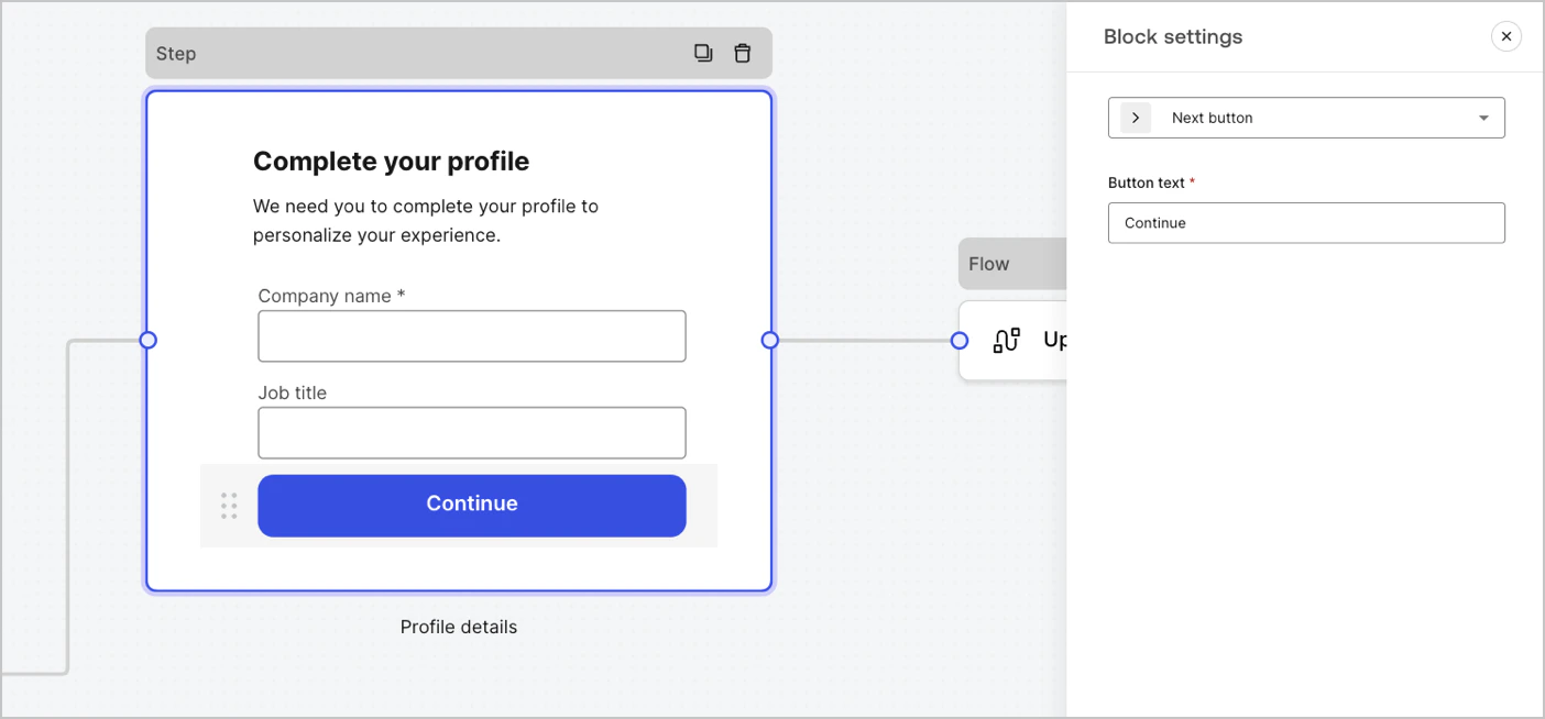 #### Available blocks in Forms
The available blocks are:
A button that lets users continue to the next form node.
* Before continuing, field validation rules are applied and validated on the client-side and server-side. If field validation rules fail, an error message is displayed for the user to verify.
* If the next node is a flow node, a spinner loader is displayed until the flow completes. If the flow fails or returns a custom error message, an error message is displayed.
A button that lets users go to the previous step node.
If a user selects the previous button, field validation rules are re-run again even if no change to input data is done before continuing.
A button that lets users skip the current step and directly jumps to the destination node.
When skipping the current step, we won't validate and neither collect any filled out information of the current step.
A component that lets users re-run a flow to generate and send a new OTP code
if a user selects the resend button, the associated flow will generate and send a new OTP code.
| Settings | Description |
| -------------- | -------------------------------------------------------------------------------------------------------------------------------------------------------------------------------------------------------------------------------------------------------------------------------------------------------------- |
| Text alignment | Select text alignment, left, center, or right |
| Text | Default text displayed when users select the resend button |
| Button text | Button text |
| Waiting text | Text displayed when users have selected the resend button. Replaces `Text` and the `Button text` settings. Use the `“{{remaining_seconds}}”` variable to dynamically display the remaining number of seconds until the send button is enabled again. For example: “Resend in `{{remaining_seconds}}` seconds”. |
| Flow | Flow executed after the user selects the resend button. |
| Max attempts | The maximum number of attempts the user can select the resend button |
| Waiting time | The waiting time between attempts in seconds. |
A rich text block to personalize the step node with additional information.
A line to divide different sections of the step node. It can contain a small text.
A HTML block to create your custom UI.
An image block to personalize the step adding images.
### Widgets components
Widgets are pre-built components, with third-party integrations, that add client-side and server-side logic to your forms.
#### Available blocks in Forms
The available blocks are:
A button that lets users continue to the next form node.
* Before continuing, field validation rules are applied and validated on the client-side and server-side. If field validation rules fail, an error message is displayed for the user to verify.
* If the next node is a flow node, a spinner loader is displayed until the flow completes. If the flow fails or returns a custom error message, an error message is displayed.
A button that lets users go to the previous step node.
If a user selects the previous button, field validation rules are re-run again even if no change to input data is done before continuing.
A button that lets users skip the current step and directly jumps to the destination node.
When skipping the current step, we won't validate and neither collect any filled out information of the current step.
A component that lets users re-run a flow to generate and send a new OTP code
if a user selects the resend button, the associated flow will generate and send a new OTP code.
| Settings | Description |
| -------------- | -------------------------------------------------------------------------------------------------------------------------------------------------------------------------------------------------------------------------------------------------------------------------------------------------------------- |
| Text alignment | Select text alignment, left, center, or right |
| Text | Default text displayed when users select the resend button |
| Button text | Button text |
| Waiting text | Text displayed when users have selected the resend button. Replaces `Text` and the `Button text` settings. Use the `“{{remaining_seconds}}”` variable to dynamically display the remaining number of seconds until the send button is enabled again. For example: “Resend in `{{remaining_seconds}}` seconds”. |
| Flow | Flow executed after the user selects the resend button. |
| Max attempts | The maximum number of attempts the user can select the resend button |
| Waiting time | The waiting time between attempts in seconds. |
A rich text block to personalize the step node with additional information.
A line to divide different sections of the step node. It can contain a small text.
A HTML block to create your custom UI.
An image block to personalize the step adding images.
### Widgets components
Widgets are pre-built components, with third-party integrations, that add client-side and server-side logic to your forms.
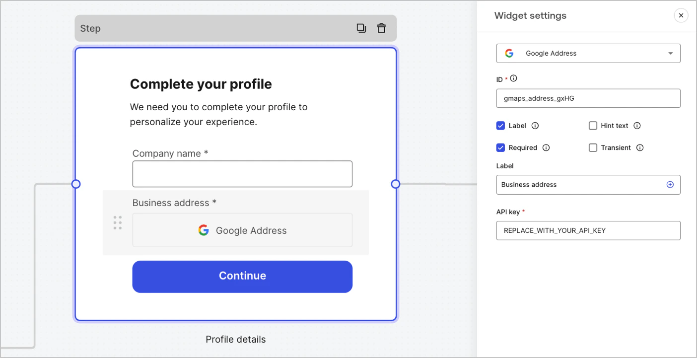 #### Available widgets in Forms
The available widget is:
A widget that lets a user enter and validate their address.
##### Google Address widget settings
The Google Address widget settings include:
| Settings | Description |
| -------- | -------------------------------------------------------- |
| API key | Requires a Google Maps API key to authenticate requests. |
##### Google Address widget output value
The Google Address widget output value data type is an `object`.
```json lines theme={null}
{
"google_address_widget_id": {
"type": "Feature",
"geometry": {
"type": "Point",
"coordinates": [
-73.9654415,
40.8054491
]
},
"properties": {
"geocoding": {
"type": "house",
"housenumber": "2880",
"street": "Broadway",
"city": "New York",
"county": "New York County",
"state": "New York",
"country": "United States",
"postcode": "10025"
}
}
}
}
```
A widget that helps protect your website from spam and abuse by verifying that a user is a human and not a bot.
The widget supports:
* Score-based (v3)
* Challenge (v2)
* Invisible reCAPTCHA badge
Differences between `v2` and `v3`:
* `v2` requires user interaction with visible challenges, such as clicking a checkbox or solving puzzles.
* `v3` runs in the background and provides a score based on user behavior, without requiring user interaction. When using this version, make sure to implement additional business logic to handle the score and determine if further action is needed.
##### Google reCAPTCHA widget settings
The Google reCAPTCHA widget settings include:
| Settings | Description |
| ---------- | ------------------------------------------------------------------------------------------------------------------------------------------------------------------------------------------------------------------------- |
| Site key | The public site key used to initialize the reCAPTCHA on your website. You can create it in [Google reCAPTCHA console](https://www.google.com/recaptcha/admin/create) or your Google Cloud Platform project. |
| Secret key | The secret key used to communicate securely with the reCAPTCHA service server-side. You can create it in [Google reCAPTCHA console](https://www.google.com/recaptcha/admin/create) or your Google Cloud Platform project. |
##### Google reCAPTCHA output value
The Google reCAPTCHA widget output value data type is an `object`.
Example of `v2` response:
```json lines theme={null}
{
"recaptcha_widget_id": {
"success": true,
"challenge_ts": "2025-03-26T11:22:18Z",
"hostname": "auth.example.com"
}
}
```
Example of `v3` response:
```json lines theme={null}
{
"recaptcha_widget_id": {
"success": true,
"challenge_ts": "2025-03-26T11:22:18Z",
"hostname": "auth.example.com",
"score": 0.9
}
}
```
A widget that lets a user verify their identity using verifiable credentials stored in their digital wallet.
##### Verifiable Credentials widget settings
The Verifiable Credentials widget settings include:
| Settings | Description |
| -------------------- | ------------------------------------------------------------------------------------------------------------------------------------------------------------------------------------------------ |
| URL | The URL value used to generate the QR code. This value is returned in the `engagement` property of the verification request. |
| Link text | Alternative text that will be displayed for users who cannot scan the QR code and prefer to open the link directly on their device. |
| Size | The size of the QR code. |
| Public token | The access token required to consume the polling endpoint. Please ensure the token is generated with only the `read:verification_request` scope to avoid exposing access to other resources. |
| Verification ID | The verification ID generated when you start the verification request. |
| Maximum waiting time | The maximum amount of time to wait for the verification process to complete. Once the set time is reached, polling will stop and an error will be thrown, regardless of the verification status. |
##### Verifiable Credentials output value
The Verifiable Credentials widget output value data type is an `object`.
```json lines theme={null}
{
"verifiable_credentials_widget_id": {
"state": "honored",
"reason": "...", // The reason field contains additional information (if available) regarding the state of the verification request.
"presentation": {} // The presentation contains the claims provided by the wallet in response to the presentation definition.
}
}
```
## Router node
Router nodes let you add rules to create conditional logic jumps between nodes.
By default, a router node has a single pass-through rule named **Default Case** that connects to other nodes. You can add additional rules based on a set of conditions that a variable must meet to then connect to other nodes. To learn more, read [Router.](/docs/customize/forms/routers)
#### Available widgets in Forms
The available widget is:
A widget that lets a user enter and validate their address.
##### Google Address widget settings
The Google Address widget settings include:
| Settings | Description |
| -------- | -------------------------------------------------------- |
| API key | Requires a Google Maps API key to authenticate requests. |
##### Google Address widget output value
The Google Address widget output value data type is an `object`.
```json lines theme={null}
{
"google_address_widget_id": {
"type": "Feature",
"geometry": {
"type": "Point",
"coordinates": [
-73.9654415,
40.8054491
]
},
"properties": {
"geocoding": {
"type": "house",
"housenumber": "2880",
"street": "Broadway",
"city": "New York",
"county": "New York County",
"state": "New York",
"country": "United States",
"postcode": "10025"
}
}
}
}
```
A widget that helps protect your website from spam and abuse by verifying that a user is a human and not a bot.
The widget supports:
* Score-based (v3)
* Challenge (v2)
* Invisible reCAPTCHA badge
Differences between `v2` and `v3`:
* `v2` requires user interaction with visible challenges, such as clicking a checkbox or solving puzzles.
* `v3` runs in the background and provides a score based on user behavior, without requiring user interaction. When using this version, make sure to implement additional business logic to handle the score and determine if further action is needed.
##### Google reCAPTCHA widget settings
The Google reCAPTCHA widget settings include:
| Settings | Description |
| ---------- | ------------------------------------------------------------------------------------------------------------------------------------------------------------------------------------------------------------------------- |
| Site key | The public site key used to initialize the reCAPTCHA on your website. You can create it in [Google reCAPTCHA console](https://www.google.com/recaptcha/admin/create) or your Google Cloud Platform project. |
| Secret key | The secret key used to communicate securely with the reCAPTCHA service server-side. You can create it in [Google reCAPTCHA console](https://www.google.com/recaptcha/admin/create) or your Google Cloud Platform project. |
##### Google reCAPTCHA output value
The Google reCAPTCHA widget output value data type is an `object`.
Example of `v2` response:
```json lines theme={null}
{
"recaptcha_widget_id": {
"success": true,
"challenge_ts": "2025-03-26T11:22:18Z",
"hostname": "auth.example.com"
}
}
```
Example of `v3` response:
```json lines theme={null}
{
"recaptcha_widget_id": {
"success": true,
"challenge_ts": "2025-03-26T11:22:18Z",
"hostname": "auth.example.com",
"score": 0.9
}
}
```
A widget that lets a user verify their identity using verifiable credentials stored in their digital wallet.
##### Verifiable Credentials widget settings
The Verifiable Credentials widget settings include:
| Settings | Description |
| -------------------- | ------------------------------------------------------------------------------------------------------------------------------------------------------------------------------------------------ |
| URL | The URL value used to generate the QR code. This value is returned in the `engagement` property of the verification request. |
| Link text | Alternative text that will be displayed for users who cannot scan the QR code and prefer to open the link directly on their device. |
| Size | The size of the QR code. |
| Public token | The access token required to consume the polling endpoint. Please ensure the token is generated with only the `read:verification_request` scope to avoid exposing access to other resources. |
| Verification ID | The verification ID generated when you start the verification request. |
| Maximum waiting time | The maximum amount of time to wait for the verification process to complete. Once the set time is reached, polling will stop and an error will be thrown, regardless of the verification status. |
##### Verifiable Credentials output value
The Verifiable Credentials widget output value data type is an `object`.
```json lines theme={null}
{
"verifiable_credentials_widget_id": {
"state": "honored",
"reason": "...", // The reason field contains additional information (if available) regarding the state of the verification request.
"presentation": {} // The presentation contains the claims provided by the wallet in response to the presentation definition.
}
}
```
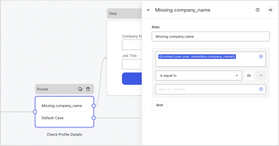
## Router node
Router nodes let you add rules to create conditional logic jumps between nodes.
By default, a router node has a single pass-through rule named **Default Case** that connects to other nodes. You can add additional rules based on a set of conditions that a variable must meet to then connect to other nodes. To learn more, read [Router.](/docs/customize/forms/routers)
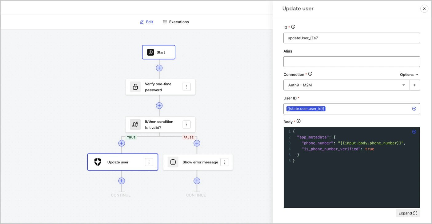
 ## Flow node
Flow nodes let you add and create custom logic and integration flows to your forms. To learn more, read [Flows.](/docs/customize/forms/flows)
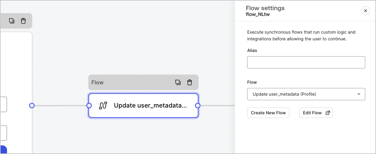
## Flow node
Flow nodes let you add and create custom logic and integration flows to your forms. To learn more, read [Flows.](/docs/customize/forms/flows)
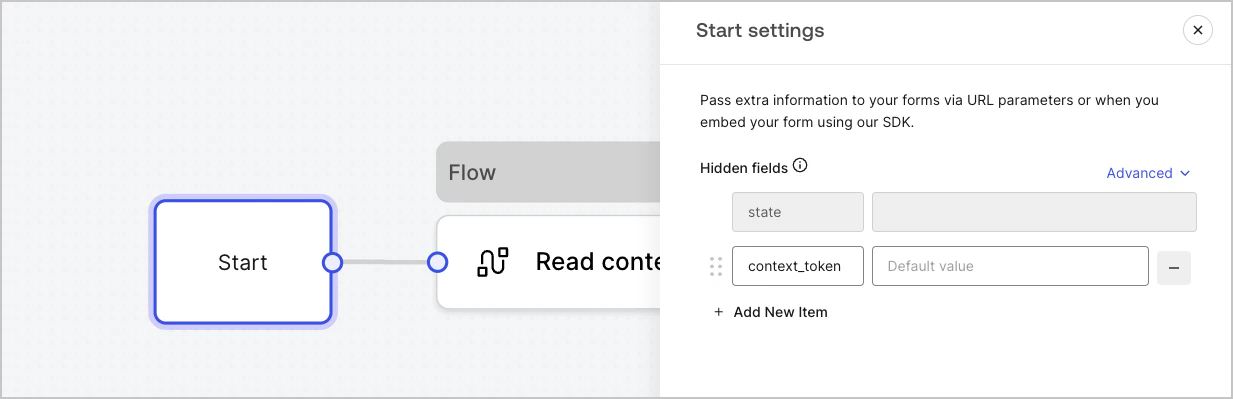
 ## Start node
Start nodes are not visible to the user. It is where you can configure hidden field variables, such as user attributes when [rendering a form with an Action.](/docs/customize/forms/render)
## Start node
Start nodes are not visible to the user. It is where you can configure hidden field variables, such as user attributes when [rendering a form with an Action.](/docs/customize/forms/render)
 ## Ending screen node
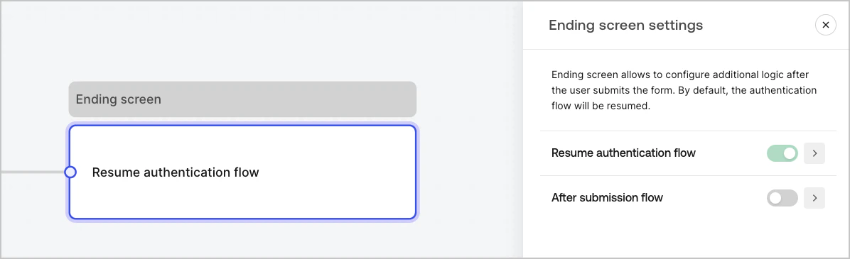
Every form has an Ending screen node. By default this node resumes the authentication flow and this is where you can configure an After submission flow.
## Ending screen node
Every form has an Ending screen node. By default this node resumes the authentication flow and this is where you can configure an After submission flow.